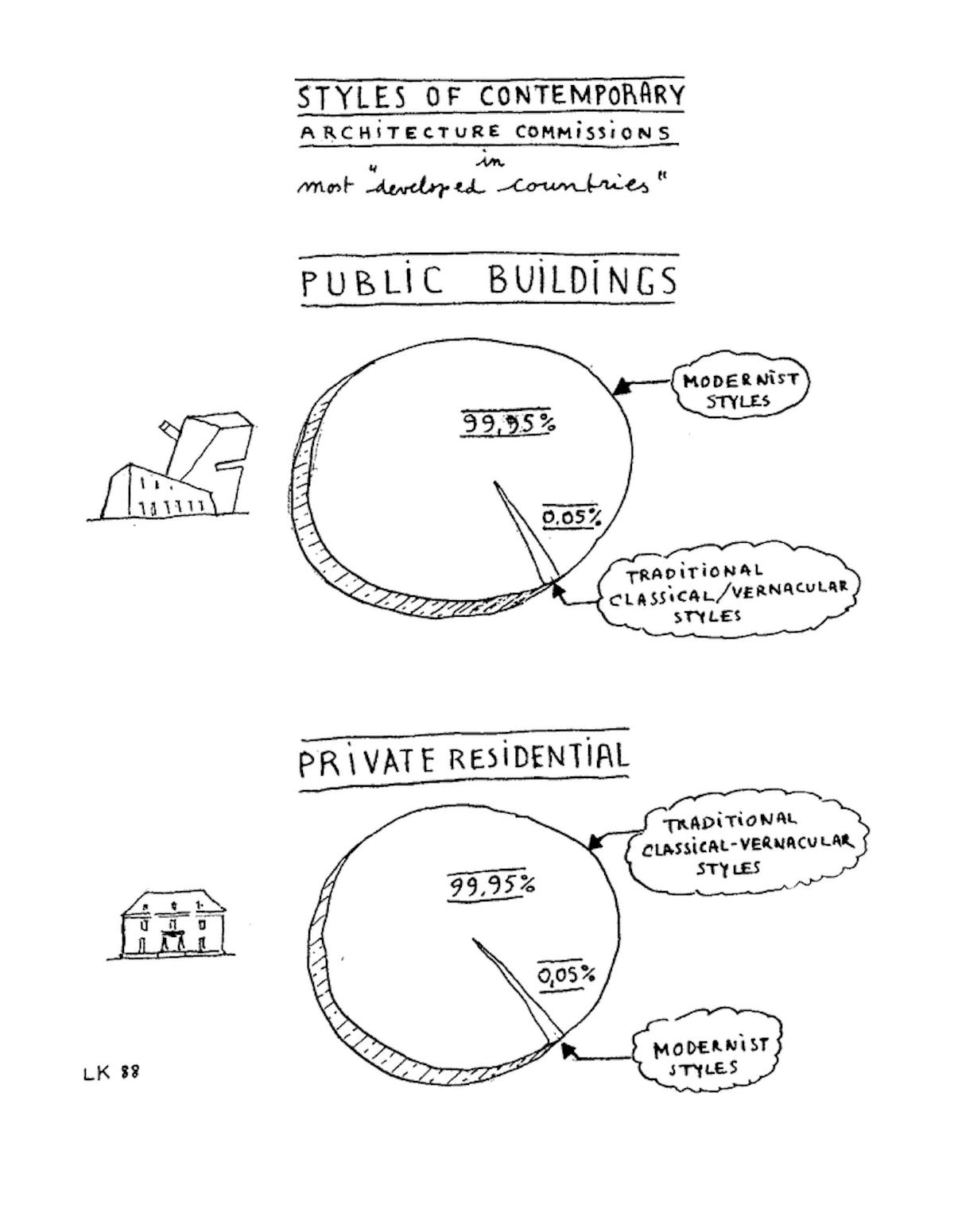
Could this be the political/architectural diagram we have been waiting for?


Can the relationship between architecture and politics ever be summarized by a well-organized diagram? San Francisco based writer Julia Galef recently offered a proposal on Twitter for distinguishing the four main political groups by their architectural preferences in a familiar format in the social media universe.
It recalls the drawings made by architect Leon Krier, who often preferred images over lengthy texts as a means of communicating architectural styles against their political intentions.
Yorumlar
Yorum Gönder