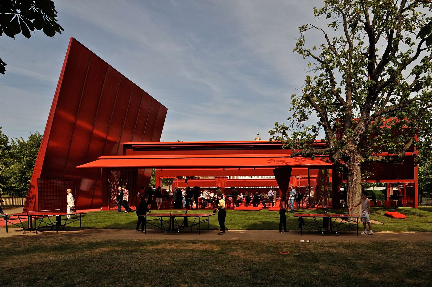

Red is a dramatic color. Always eliciting a strong visceral response, we’ve evolved to become alarmed when we see it, since its oldest association is with the natural hue of blood when it’s outside the body. As such, red has been employed over time as the color of warning signs, stoplights and emergency response, and when used in architecture, it is often in the service of one of these goals. The importance of this association is not lost on architects who use it discriminately. As evidenced in the projects below, it is exactly these subconscious attributes that make red a popular color to apply liberally in non-emergency settings. Whether helping a project stand out from its surroundings, or as a complement to them, it’s impossible to divorce this color from its deeply reflexive meaning. These projects exhibit a wide range of scale, program and intent, but the attention-grabbing effect is always the same: If you make something red, people will notice. Blood Center by F A A B Architektura Adam Białobrzeski | Adam Figurski, Raciborz, Poland A bold application of red is used not only for obvious associations with this blood donation ... , Ross Brady, read more http://ift.tt/1pJdC3b


Yorumlar
Yorum Gönder