The 6 Most Annoying Trends in Architectural Visualization

Architects: Showcase your next project through Architizer and sign up for our inspirational newsletter.
When working on a project that requires a complex workflow, and where potential creative decisions are seemingly limitless, it’s easy to make errors, from the frivolous kind to the grave. It can also push one to follow clichéd, repetitive or bland trends as a simpler means to completing a task. Specifically, when looking within the world of architectural visualization, these tendencies are very common.
Can you create a powerful architectural rendering that avoids following tired tropes and common clichés? If so, submit it for the One Rendering Challenge before the Early Entry Deadline on November 22nd for a chance to win $2,500, professional rendering packages and global recognition:
Enter the One Rendering Challenge
In Partnership With
![]() The biggest marketplace in the world for digital services
The biggest marketplace in the world for digital services
With architectural renderings proliferating across the web, having the foresight to avoid relying on prevalent methods is essential to help you stand out, and can have the added benefit of helping you clarify the narrative of your project. To help you with your submission, we asked the members of our esteemed One Rendering Challenge jury for their thoughts on what rendering mistakes and annoying trends really grate on them. Take notes, renderers!
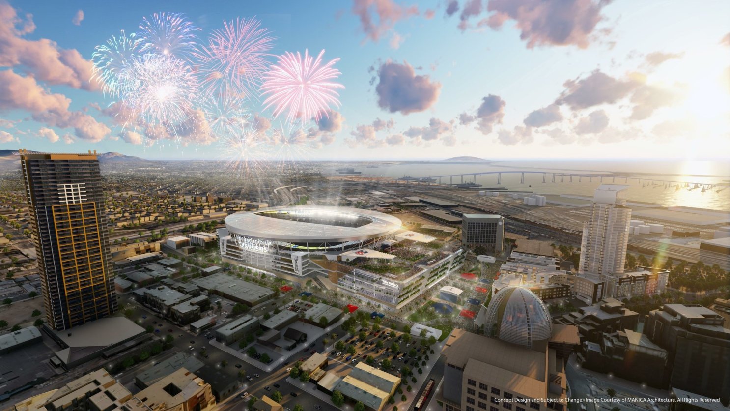
Those fireworks will never see the light of day in San Diego from this abandoned project; render via MANICA Architecture / Greyscale Gorilla
1. Filling a scene with busy details
It’s important that your renderings communicate the desired character and tone of the architecture. Overloading an image with unnecessary or superfluous details can cloud the unique essence of a structure. Sometimes, the simpler a scene, the more effective it is in expressing itself. Architectural visualization specialist Ronen Bekerman asserts: “Stop trying to get it all into a single image! Some mystery goes a long way when trying to evoke emotion.”
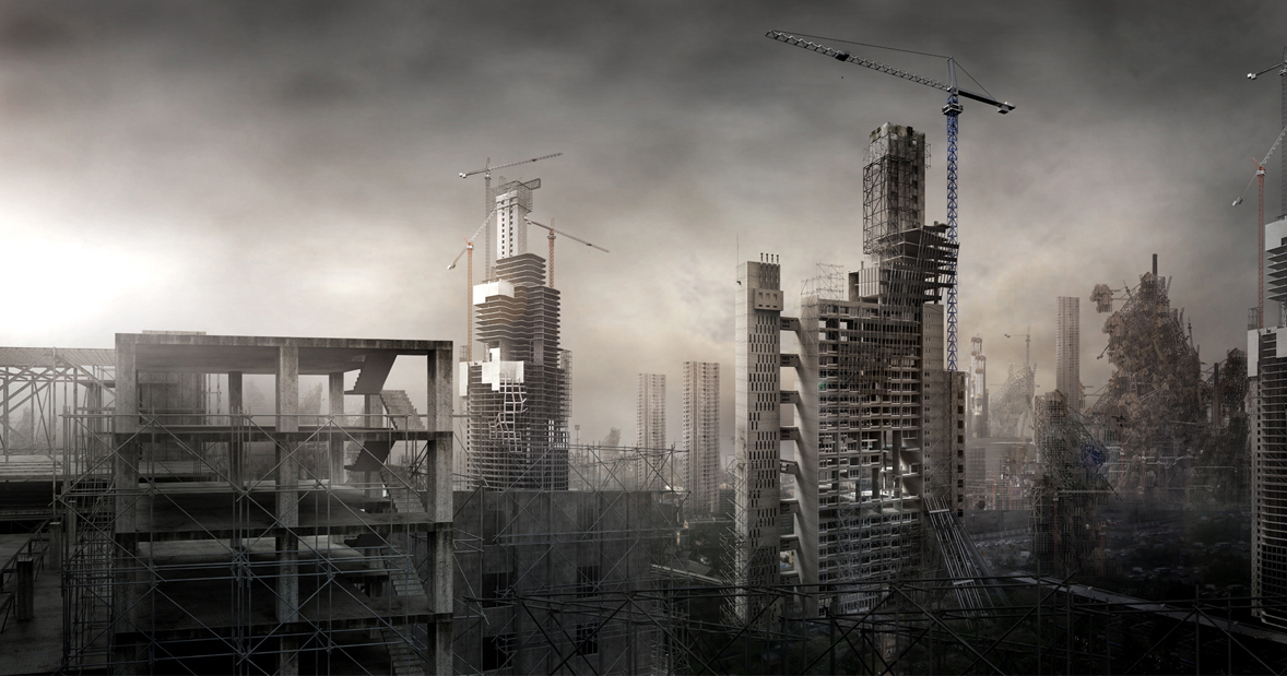
It’s an atmospheric but but all-too-familiar view from the penthouse terrace in MEGACITY 1.0. Image: Fanciful Megalomania by Jonathan Gales
2. Creating excessively bleak and depressing atmospheres
Illustrating melancholy and grim atmospheres for the sake of being melancholy and grim shouldn’t be an approach if this tone isn’t consistent with the narrative your rendering is meant to present. Methanoia’s Juan Rico respectively states: “Let’s finish with the armageddon-inspired images! The end of the world is still far.
“Architecture must be placed on the user experience, and that needs to have a happy ending. The message has to be positive and not melodramatic, connect with good feelings and not with weird ones.” Meanwhile, Mengyi Fan of SHoP Architects laments the proliferation of “overly moody imagery that doesn’t necessarily mesh with the story the image is trying to tell nor resonate with a wide audience.”
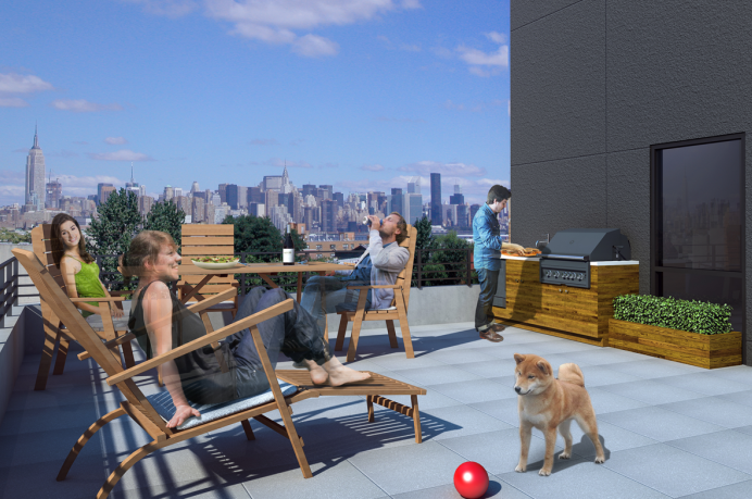
That dog and its ball look a little … staged? Image via S3 Architects / Brick Underground
3. Relying too heavily on stock images
It’s important to keep all of the elements within your renderings as original as possible. By creating and relying on your own visuals, the quality, cohesion and individuality of your work will shine through. Matthew Bannister, co-founder of multi-disciplinary design and communications agency, DBOX, can’t stand it when people “use images that are downloaded from the Internet (randomly googling ‘girl on bike’, for instance, and incorporating into a rendering), as if all IP is in the public domain.
“Shoot your own stuff, it’s all part of your visual. If your visuals are made of other people’s work, don’t be surprised when AI sends you a speeding ticket in a few years. Additionally if you shoot your own stuff matching resolutions will be more achievable.”
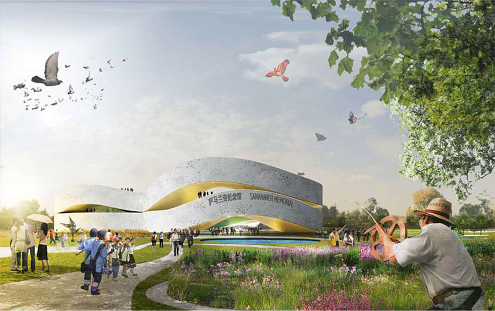
Those flocks of birds get everywhere! Image via Holm Architecture Office / Bustler
4. Using clichéd scale figures
Carefully consider your selection of scale figures and adornments for renderings. The architectural visualization world is filled to the brim with stereotypical and overused graphics. For renowned designer and visualizer Keely Colcleugh, one of the worst sins in architectural visualization is to “give little consideration towards entourage, relying on established and overused narrative tropes..also kid with balloons.” Her most loathed assets? FOB (flock of birds) and kids with balloons.
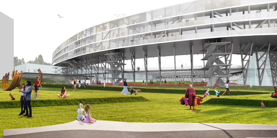
Besides some very interesting scale figures employed in the foreground, was it really necessary to model each and every one of those ugly concrete staircases, disappearing into the distance? Image: Feyenoord City by OMA
5. Getting stuck on trivial details
The process of completing a great rendering is lengthy and tedious, so try not to dwell on insignificant details that have little impact of the final result. Britta Wikholm, Art Director and Founder at visualization company, Visulent AB, states: “One mistake that I see a lot of people do is that they get stuck on details that no one ever notices.”
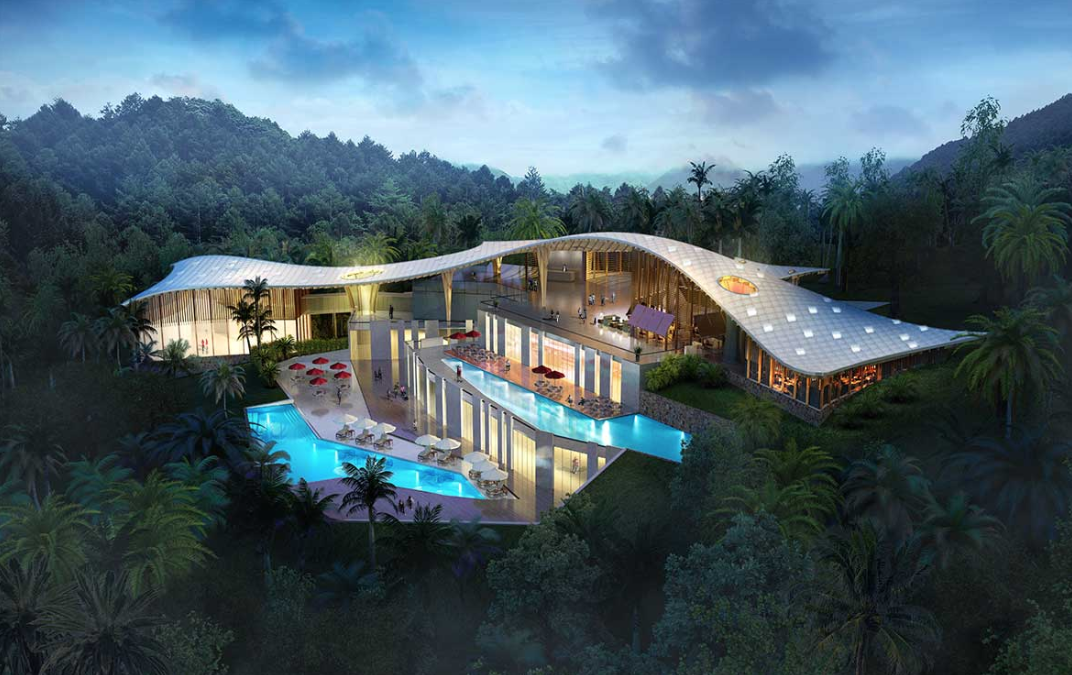
Is this really the best way to light this scene? Image via xo3d
6. Improperly executing ideas
Given the magnitude of rendering styles, techniques and features, it’s easy to fall into the trap of inappropriately integrating certain elements along with incorrectly executing them. Rendering expert Alex Hogrefe expands on this pitfall: “Most of the mistakes I see are due to certain ideas not being implemented correctly.
“There are so many styles in visualization and they all have their place; in fact they can be really compelling if done well. Where things start to fall apart is when certain styles or trends get mixed together, or artists do not know how to correctly execute them. For example, placing the sun directly behind the camera tends to lead towards a flat looking image. However, as tough as this type of image is to pull off, I have seen some really amazing illustrations that use this technique.”
Now it’s your turn: Submit your best renderings and tell us your architectural story for a chance to win $2,500, professional rendering packages and global recognition for your work:
Enter the One Rendering Challenge
In Partnership With
![]() The biggest marketplace in the world for digital services
The biggest marketplace in the world for digital services
Architects: Showcase your next project through Architizer and sign up for our inspirational newsletter.
The post The 6 Most Annoying Trends in Architectural Visualization appeared first on Journal.
, Nathaniel Bahadursingh, read more Journal http://bit.ly/2Jy4CuR
Yorumlar
Yorum Gönder