5 Tips for Improving Your Architecture Portfolio

Whether you are an architecture student looking for your first internship or an architect presenting work to prospective clients, a portfolio is undoubtedly one of the most important parts of the profession. It is common to think that a portfolio is a mere compilation of one’s past work, but here’s a lesser known fact: Your portfolio also determines your future work potential.
Documenting great work experiences in your portfolio will lead you to more opportunities in the future. These opportunities may come in the form of jobs at offices with interesting projects, more leads for clients and projects, and with a combination of the two, greater design freedom and an even better collection of work. This is why a great portfolio not only takes you to your next milestone, but also puts you on a trajectory to achieve your long-term goals.
1. Design your portfolio

This was probably the biggest game changer between an entry level student to professional architecture job. Portfolio is much more than a compilation of your work. It is a representation of yourself.
Consider how the reader might traverse through your pages, and ensure that correct information is visible and clear. Ask yourself “What are my strengths and weaknesses?” “How do I want to be remembered?”
2. Strive for consistency
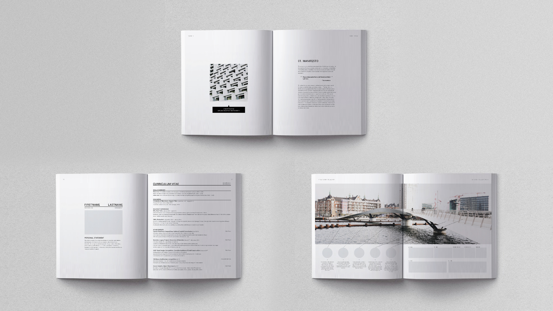
Establish your layout design language early on, and stick to it. This includes choosing a common font and font size, clear project transitions, and establishing a grid for any visual elements. This allows readers to easily understand your project narratives, and recognize important elements and where to find them. It might be difficult at first to come up with a layout and style that works across all your projects. Once you establish a strong design language, you can start to break the rules slightly to add a creative spin to it.
Utilize InDesign’s master pages and paragraph styles. If you want to learn these, check out “Life Changing InDesign Tips & Tricks” on our YouTube channel.
3. Experiment with delivery methods
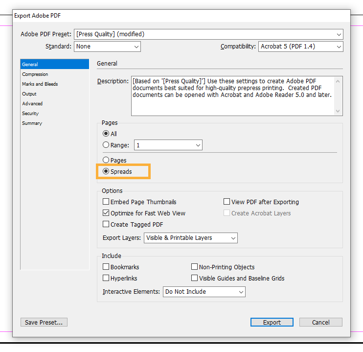
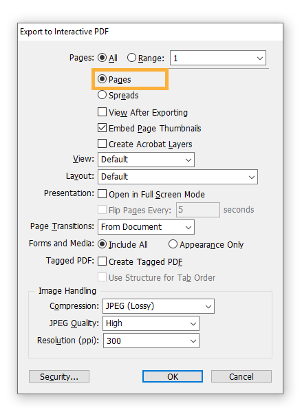
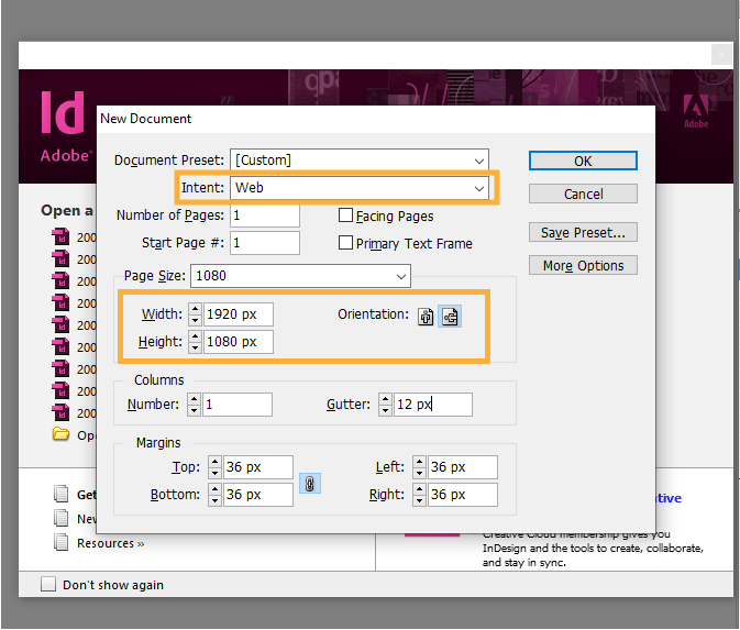
Traditional portfolios were only delivered in physical books. In this day and age, however, they can be delivered in several formats, including print, slideshow or issuu. Make sure to export your file appropriately to ensure that your work is showcased in the best light possible.
- Print: portrait spread complete with back cover:
- Slideshow: fit to computer screen 16:9 aspect ratio:
- Issuu: export by pages:
4. Include personal work
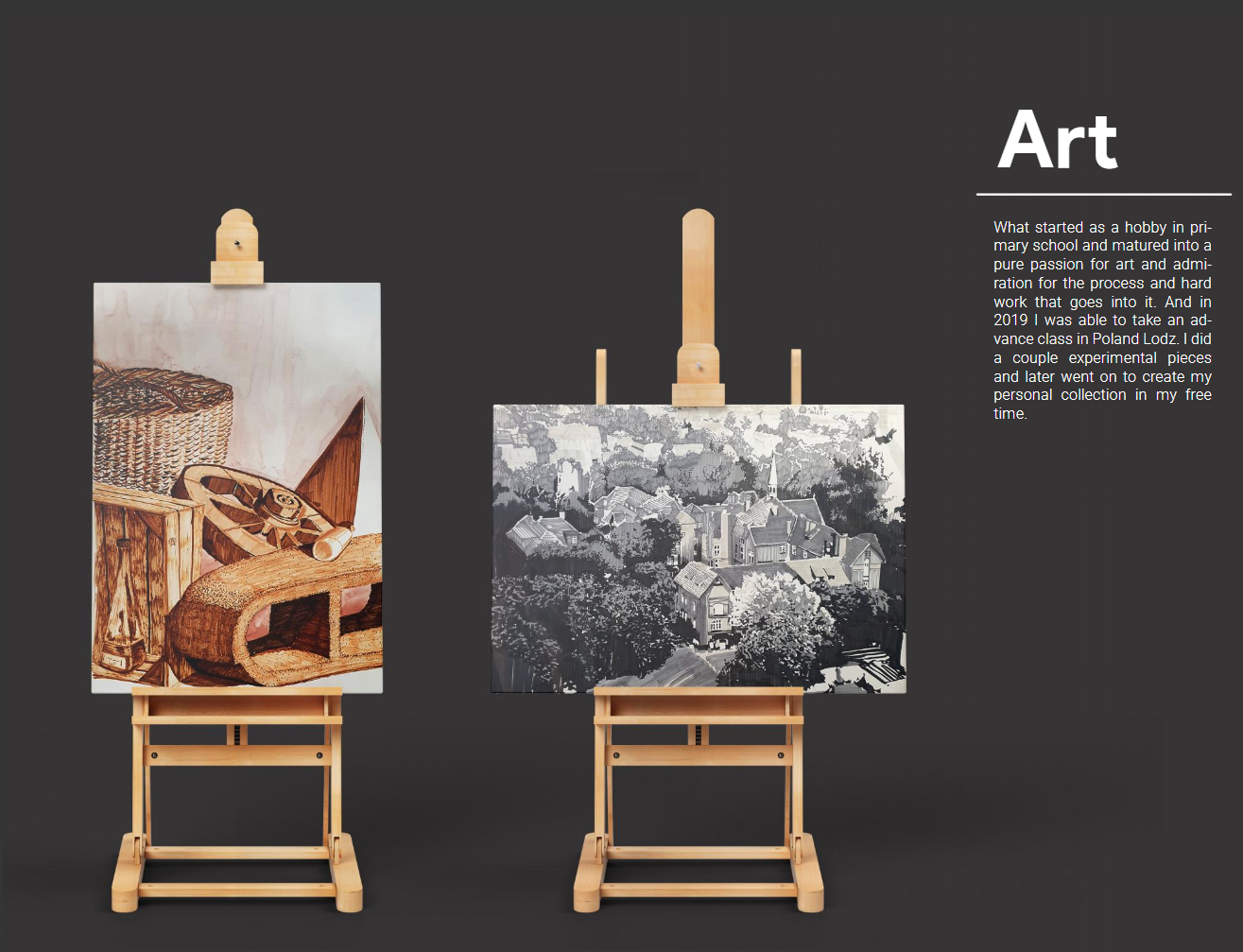
Personal work at the end of your portfolio is a great opportunity to distinguish yourself from the crowd. Have some fun and make yourself likable to your future coworkers and faculties. Because everyone one includes sketches and paintings doesn’t mean you have to. Find something unique, and don’t be afraid to be provocative too!
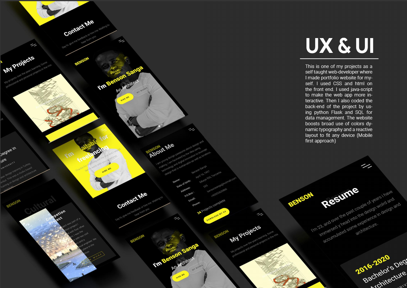
Some of the most unique personal work sections included fashion, publication, UXUI design, and cinematography to give you some ideas.
5. Create a narrative
Narrative is the ultimate destination for your portfolio. Excellent design experience, beautiful illustrations, and proof of software skills are in service of this intention. The reason is because it dictates the overall impression of YOU as a personal brand.
All the previous points are done in service of creating the narrative. In addition to excellent work, strong design language, consistency, and unique works emanates a sense of trust and amiability.
Archi Hacks is founded by an ex-BIG, OMA employee dedicated to helping young professionals find success in their fields. We provide free lessons via YouTube, and Architizer articles amongst other services. One of which includes private portfolio coaching, which has provided us with the privilege to review almost 50 portfolios from our clients.
Archi Hacks is also on YouTube and Instagram in case you’re looking for more interesting tips & tricks to upgrade your career. Stay tuned for the next series of tutorials!
The post 5 Tips for Improving Your Architecture Portfolio appeared first on Journal.
, Archi Hacks, read more Journal https://bit.ly/3ggvSvF
Yorumlar
Yorum Gönder