In the Round: 8 Curvaceous Examples of Brutalist Architecture

Architects: Showcase your next project through Architizer and sign up for our inspirational newsletter.
When architecture critic Reyner Banham set out to identify what would come to be known as Brutalism, he distilled his concerns into a single, simple question. “The New Brutalism,” he asked. “Ethic or aesthetic?”
In Banham’s binary, the post-war building style was not about what makes it, in popular opinion, seem so obviously “brutal.” While often defined by its concrete construction and imposing formal expression, Brutalism had just as much to do with a more implicit set of characteristics: a newfound moral seriousness among architects and a socialist-tinged desire for honesty in public architecture.
Its pioneers, British architects Peter and Alison Smithson saw its rhetorical potential. “Brutalism tries to face up to a mass-production society, and drag a rough poetry out of the confused and powerful forces which are at work,” they said. “Up to now brutalism has been discussed stylistically, whereas its essence is ethical.”
Nevertheless, the style can’t be thought of without mention of its signature visual qualities — cast concrete surfaces, exposed functional elements, stark and unapologetic forms. Banham himself singled them out: “In order to be Brutalist,” he wrote, “a building has to meet three criteria. The clear exhibition of structure, the valuation of materials ‘as found’ and memorability as image.”
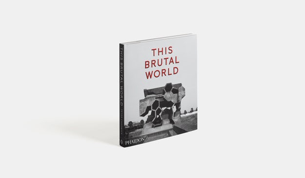
In This Brutal World, a new book from Phaidon by graphic designer Peter Chadwick, pages abound with architecture that meets Banham’s test. Monochrome shots of Brutalist buildings around the world, from the 1950s to the present day, make a solid case for memorability as image. The eye follows the contours of cultural centers, hospital extensions, airports and apartment blocks, enraptured by a now-lost architectural honesty. This collection extracts a few projects that share a tendency towards the curve, combining organic outlines with manmade materials in ways that might seem incompatible but never fail to inspire awe.

St. Joseph’s Hospital by Bertrand Goldberg, Tacoma, Wash., United States, 1974
An extension of the Tacoma hospital complex, the undulating surface of Bertrand Goldberg’s design is an articulation of his theory of “nuclear design” in which each quadrant housed “villages” of patient beds clustered around nursing stations. The arrangement was conceived with the intention to optimize access to care, and the outward appearance of the earthquake-resistant structure honestly reflects its internal design.

‘The Egg’ Center for the Performing Arts by Wallace Harrison, Albany, N.Y., United States, 1978
Part of the Rockefeller Empire State Plaza in the state capital, the cultural center was designed to reflect Nelson Rockefeller’s penchant for sculptural architectural design. Fittingly, the inclined “Egg” appears to rest on a pedestal, which connects the structure to six underground floors.

Bio-Towers, renovated in 2008 by Jähne & Göpfert and Zimmermann & Partner, Lauchhammer, Germany, 1957
Built in brick, this cluster of industrial structures were part of a lignite coking plant in the former GDR. Although seemingly monumental, their curved forms reflect a surprising simple filtering technology and the internal circulation is snuggly fitted amidst each group of four towers. Although the plant closed in 1991, the towers have been renovated and opened for tours, symbolic as they are of a once industry-heavy segment of the country.

Grand Central Water Tower by GAPP Architects & Urban Designers, Midrand, South Africa, 1996
This striking architectural feature would have made Bernd and Hiller Becher, who began documenting industrial structures in the 1960s, swoon. Its cantilevered structure made of prestressed concrete supports a massive conical tower designed to hold 6,500 cubic meters of water on the outskirts of Midrand.

Trudelturm by Hermann Brenner and Werner Deutschmann, Aerodynamic Park, Berlin, Germany, 1936
Part of a collection of alienesque structures in an aerodynamic research facility, the Trudelturm is an architectural structure so unusual that it had a brief cameo in the 2005 sci-fi film “Aeon Flux.” But its strange design is entirely reflective of its purpose: the concrete blob was built to investigate the phenomenon of aircraft spin, serving as an upended wind tunnel used for research testing.

Meditation Space by Tadao Ando, UNESCO, Paris, France, 1995
Known for his contemporary renditions of traditional Brutalist aesthetics, Tadao Ando designed a minimal meditation space for the UNESCO headquarters in Paris, in celebration of the organization’s 50th year. Built with the notion of inclusivity in mind, the concrete cylinder is lit to stunning effect through a small slit between the round walls and the floating roof.

Trans World Airlines (TWA) Terminalby Eero Saarinen and Associates, JFK Airport, New York, N.Y., United States, 1962
One iteration of the architect’s continuing investigation of curved forms, the TWA Terminal in Queens celebrated the onset of a future defined by air travel. Called “the Grand Central of the jet age,” the flight center is housed underneath a thin shell roof that creates a womb-like interior hall.

Les Choux de Créteil by Gérard Grandval, Créteil, France, 1974
Dubbed “the cabbages,” this residential development in the southeastern suburbs of Paris was built to address the metropolitan region’s growing need for affordable public housing. Its curvaceous design involves large round structures covered in smaller petal-shaped balconies that were designed to allow each inhabitant a private viewing spot. While built primarily in concrete, the vegetal reference point of the project makes it seem to sprout almost naturally out of the ground.
Want to explore the Brutalist tradition? Get yourself a copy of Phaidon’s stunning title “This Brutal World”:
The post In the Round: 8 Curvaceous Examples of Brutalist Architecture appeared first on Journal.
, Maya Sorabjee, read more Journal https://bit.ly/3ihak4e
Yorumlar
Yorum Gönder